
Building the identity
Color, typography, motion. The wordmark isn't set in an existing typeface — I drew the characters in Illustrator so the letterforms could carry the idea rather than borrow it. A key part of was the double-N character that collapses into a single-N, so designing that was first. The rest of the characters were influence from the geometry of this dynamic character.
The motion background came from a node-and-connection visual that read, intentionally, a little like DNA. Connection as something intrinsic rather than aspirational.
Designing for 73 feet
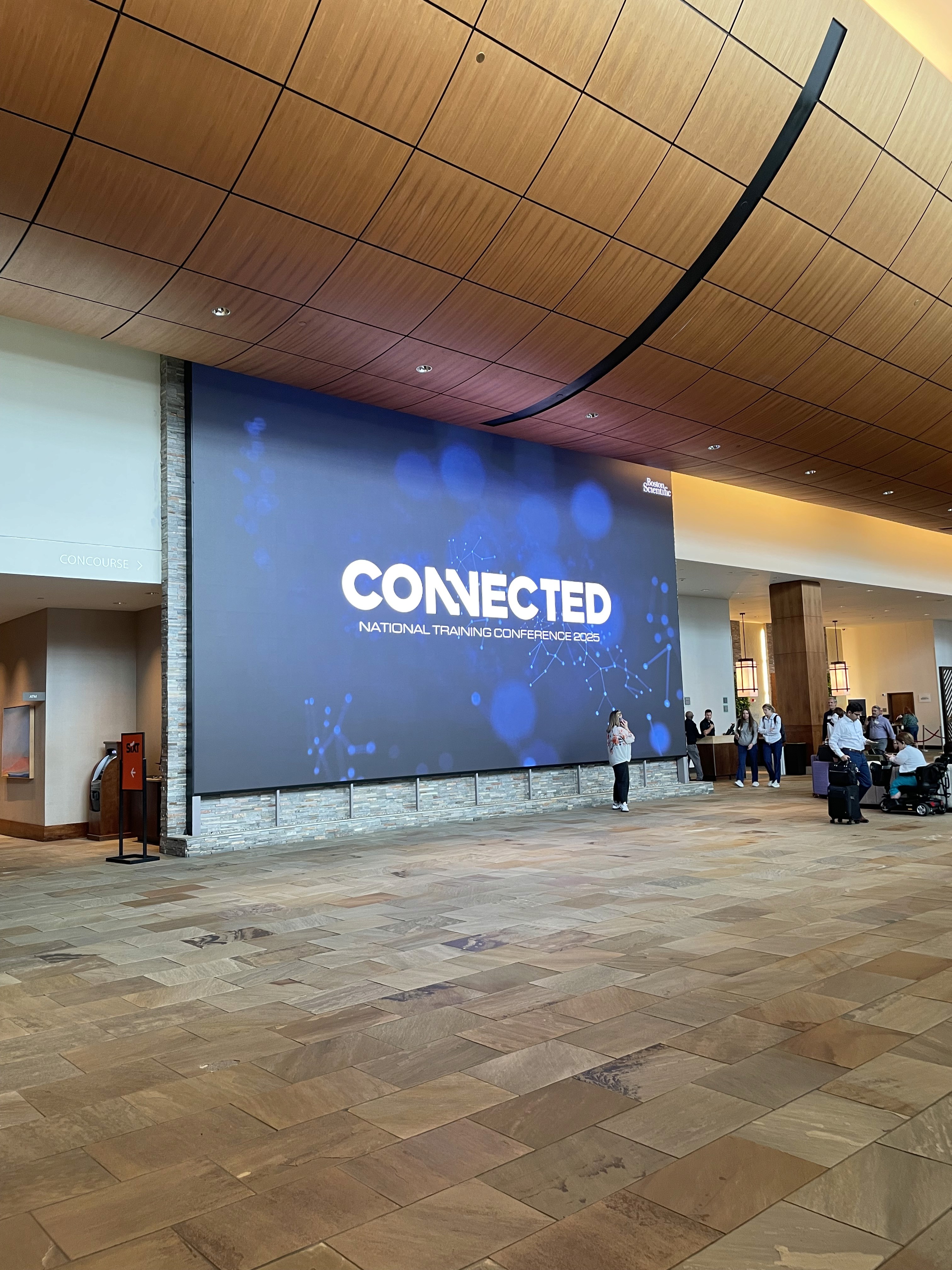
The 2025 meeting was at the Westin Boston Seaport, which has an LED wall large enough that the usual rules stop applying. I worked directly with the venue's lead technician to get specs, dimensions, frame rate, maximum loop length, and hard limitations before ideating anything. My intent was to appreciate the scale of this canvas I was given, and to fully leverage its presence to spotlight employees and guest speakers.
What happened in the lobby
People inevitably observed that this was on a loop and stayed to watch. Employees stood in front of the wall in groups waiting for their faces to come back around, often taking celebratory selfies once they did. Producing those moments was not in the brief.

Kinetic typography from the start
The wordmark was drawn to move, not just to sit still. Characters that assemble, collapse, and resolve. This way, the idea of "Connected" performed itself rather than being just a descriptor. I taught myself the technique to build it, then put it straight into the theme debut video.
A second year, not a second campaign
Connected came back for 2026, which is a different problem than launching it. The wordmark stayed — that was the point of building one — but everything around it got rebuilt. New palette, new applications, a new venue in Austin.
Extending the brand, not leaving it
The 2026 palette was derived from Boston Scientific's own brand colors rather than invented alongside them. Caribbean and Action Blue through Plum, expanded into a range wide enough to carry a full environmental system. The design challenge was to simultaneously keeping the wordmark while bringing it back refreshed.
Same identity, different rooms
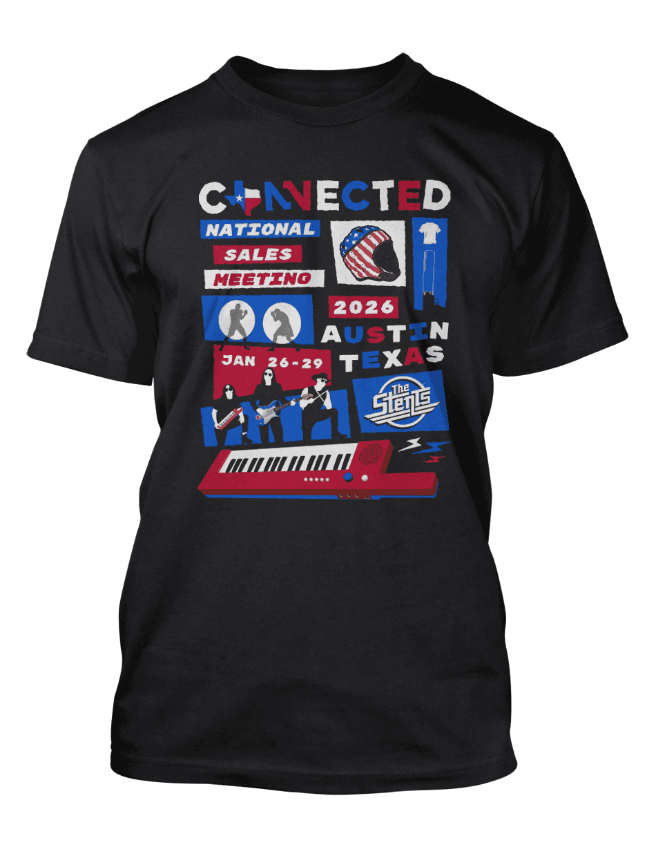
Austin needed treatments the previous year didn't. Cramer (the brand experience agency producing the meeting) built the sets; I supplied the updated Connected wordmarks that ran in them. A neon-on-reclaimed-wood Connected for the honky-tonk staging behind the dueling pianos, and a gig-poster treatment for merch, complete with a fictional house band.


Back to all work

