
Seeing the unseen
Boston Scientific's field sellers needed to understand endoscopes before they could sell them, and the training that existed was static — text and diagrams. The framing that unlocked it: an endoscope has anatomy the way a body does. Teach it the way a science textbook does, by lifting off the outer layer and showing what runs underneath.
One channel at a time
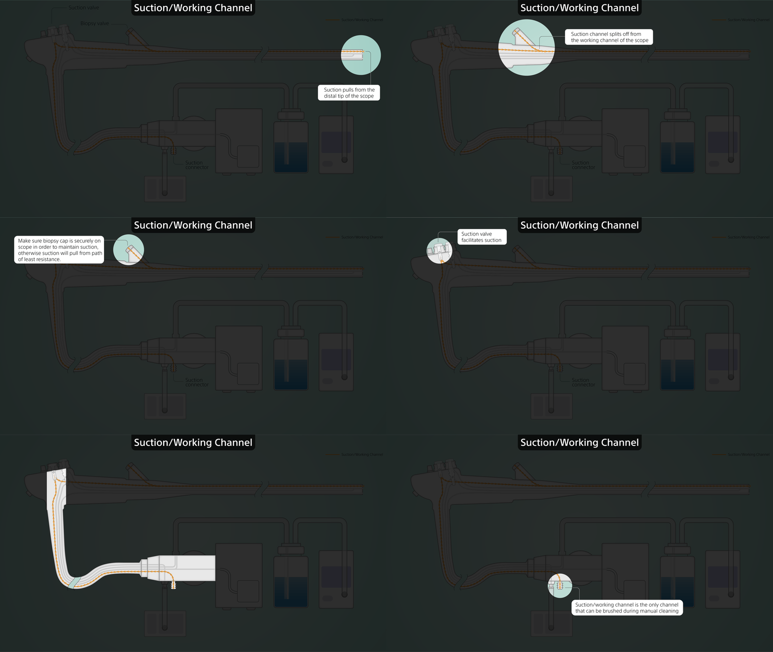
Working with an instructional designer, we landed on a two-part structure. Each channel gets isolated and explained on its own, so a first-time learner can follow one system without competing information. Then all four run together — and the complexity that was hidden becomes the point.


No platform, no precedent
Nobody specified to me how these training visuals should be made. There was no format and no template. The instructional design team worked in PowerPoint, which is where this would have ended up by default. I advised that this would be a perfect project to port over to Adobe Illustrator, where I could leverage the full strength of vector-based visuals.
An animation facelift
Years later, I revisited this project to build it in motion, on the argument that flow through a channel is something you have to watch to understand. Being the author of the original Illustrator files allowed me to conveniently port over assets onto After Effects.
Still in rotation
Built in 2020 and still used by BSC trainers to onboard new sellers. The feedback that comes back to me from the trainers is that it's still the one piece of training that makes the endoscope click for new learners.


Back to all work

