Greater than the sum
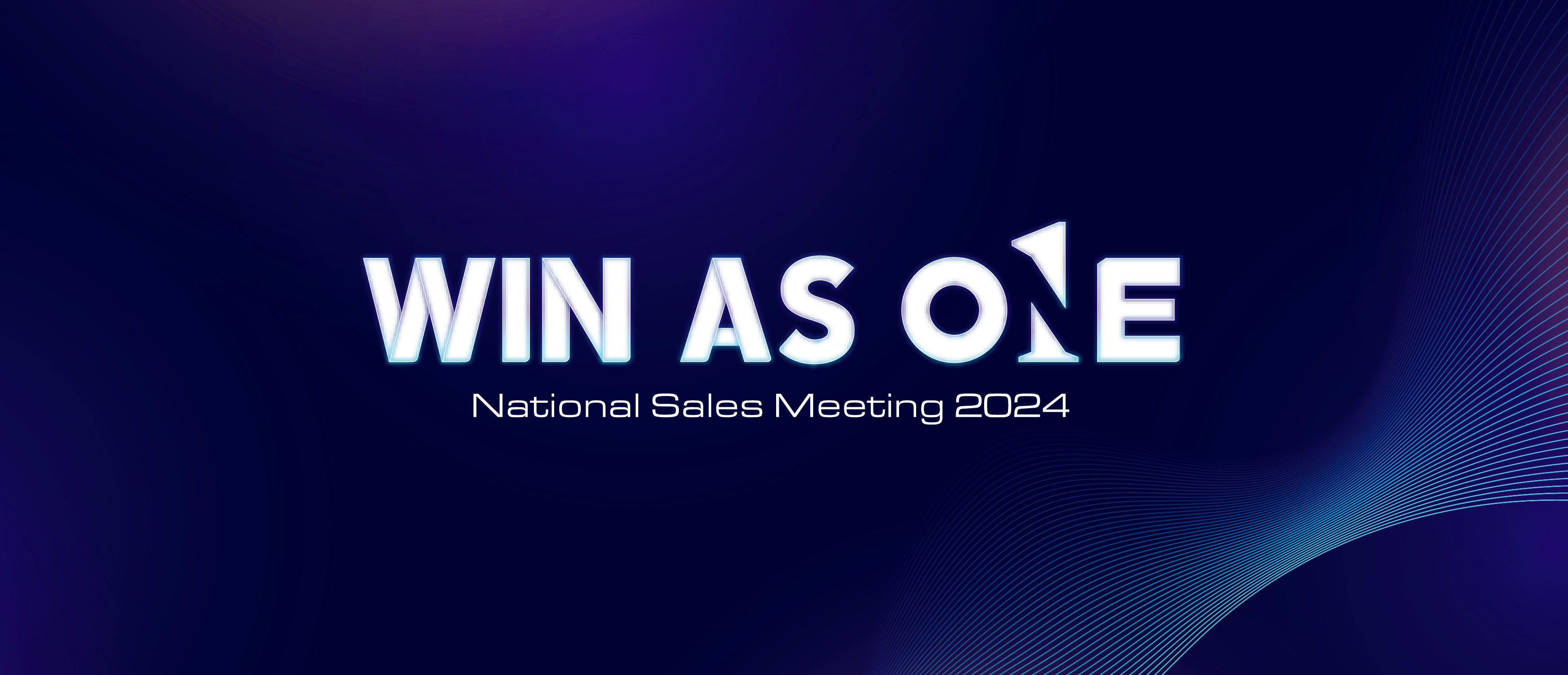
“Win as One” was Boston Scientific’s 2024 mantra: a clear call for the Sales Force to move into the field as a singular team. The campaign had to feel confident, collective, and energized enough to function as a daily motto.
Merging characters, and practicing restraint
I merged the character 1 and the word ONE into a single logo system that could carry the message with immediate recognition. In terms of design, this was as much of a practice in preserving the N. I was able retain the N's presence by imposing its negative serifs onto its neighboring E.
The temptation with a device like this was to run it everywhere. There were other opportunities in the wordmark to shoehorn in a "1" but intentionally restraining myself was the right move to keep this from becoming a gimmick.
Debuting the theme on camera
The theme reveal included a production interview, my first time explaining work in that format. This was an opportunity to show design thinking for an audience that doesn't think about type: that this wasn't a font, that the characters were drawn by hand, and to peel back the curtains on the process of creating a yearly theme.


Transforming this into a set
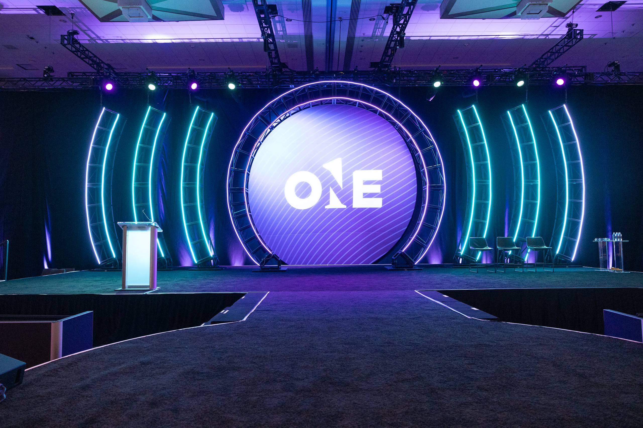
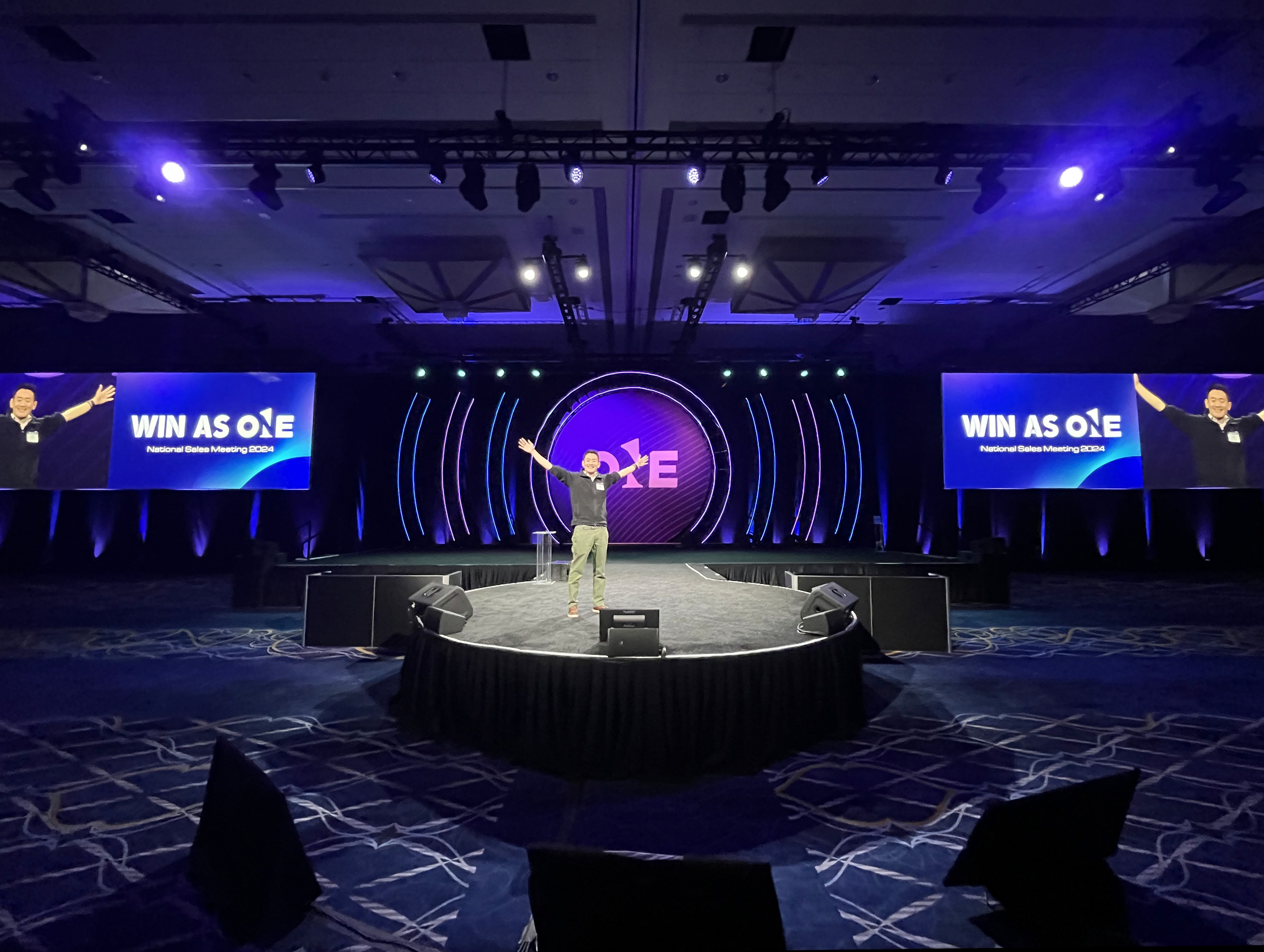
Cramer, produced the environment, and they took the wordmark somewhere I couldn't have on my own: a circular opening cut into the set, echoing the O at architectural scale. The presenters walked onto the stage from the O. That payoff of building a set identity belongs to their build team.
Seeing this in person truly validates the time I spent sweating the pixels on screen.


Back to all work

